

One of the most frequent questions we get from our clients is “How can I make my site mobile-friendly?”
The truth is that designing a site for mobile phone and tablet browsing is just as important as designing one that looks great on a computer screen. According to PewResearch as of May 2013 63% of adult Americans use their cell phone to browse the internet, and 34% go online mostly via their phone. With the increasing popularity of both smartphones and tablets those numbers are on the rise.
So, we strongly believe that you need a site that looks and functions wonderfully no matter how your visitors are browsing it. The solution is Responsive Design.
What is Responsive Design?
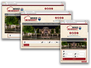 Responsive design is a method of website design where a websites elements shift around to fit different screen sizes. Rather than showing the desktop version of a site in a much smaller size on a smartphone, the design shifts from one medium to another so that it is easy to read and navigate no matter what device you’re using.
Examples
Responsive design is one of those tricky things that is easier to show than tell about. We invite you to visit these responsive sites on your computer and your smartphone and/or tablet to see the differences:
If you don’t have access to a smartphone or tablet thats ok! You can resize your web browser and watch the elements of the site shift to accommodate the smaller size!
Which types of sites can be responsive?
Any of our sites and blogs can be responsive. WordPress websites can be created with responsive in mind just as easily as our custom sites. The first and second of our examples above are custom sites, SizzlingStudios.com is built on wordpress!
Responsive Design and your IDX
Unfortunately, not all IDXs are compatible with responsive design. If you are looking to create a mobile friendly website, but you have an IDX in mind, be sure to ask them if they cater to responsive!
Here is a short list of IDX providers who have either a responsive-ready solution, or a different but compatible solution for mobile:
This is by no means a comprehensive list. If you have a different IDX in mind, remember to ask them about responsive! If you need help asking the right questions, we can assist you.
An Alternative to Responsive
Responsive design is by far the best way to make your website mobile-friendly, but in most cases it calls for a complete redesign of your existing website, which can be costly if you were not already planning on a redesign.
An alternative can be found in these mobile website creators:
For a small monthly fee, these third party applications will automatically create and host a mobile version of your website that is based on your current live website. This site can then be modified using their tools. When a user visits your website, a check will be done to see what kind of device they’re using. If they are using a smartphone, they will be directed to the mobile version of the site.
Pros
- Offers a mobile solution for your website
- Inexpensive
- Quick
- Does not require a redesign of your current website
Cons
- Because the mobile site is a standalone version, it needs to be updated when your website is updated.
- Not compatible with some website elements, such as slideshows, things shown in an iFrame, and our Homes Database
- Requires your IDX to have a standalone mobile home search